Axorixunib: Crafting Dynamic Dashboards for Clearer Insights

Vidhya Rajendran
6 Comments
Axorixunib: Crafting Dynamic Dashboards for Clearer Insights
Special Offer for New Clients — Bonus on Your First Project!
Start your journey with Axorixunib and receive an exclusive bonus on your initial order.
The digital age has ushered in an unprecedented era of data abundance. Organizations across all sectors are awash in information, from operational metrics to customer behaviors. This deluge presents both immense opportunities and significant challenges. Traditional methods of data analysis often struggle to keep pace, leading to missed insights and delayed decision-making. The need for effective data interpretation has never been more critical for strategic advantage.
Historically, data presentation relied on static reports and complex spreadsheets, which, while comprehensive, lacked interactivity and immediate clarity. Researchers have long explored ways to transform raw numbers into understandable visual narratives. Early attempts focused on basic charts and graphs, laying the groundwork for more sophisticated techniques. The goal has always been to bridge the gap between complex datasets and human comprehension, making information accessible to a broader audience.
The evolution of data visualization tools has been remarkable, driven by advancements in computing power and user interface design. Prior studies consistently highlight the cognitive benefits of visual data representation, demonstrating that humans process visual information far more efficiently than text or tables. This understanding has propelled the development of interactive platforms, moving beyond mere display to active exploration. The demand for systems that empower users to slice and dice data dynamically became a clear imperative.
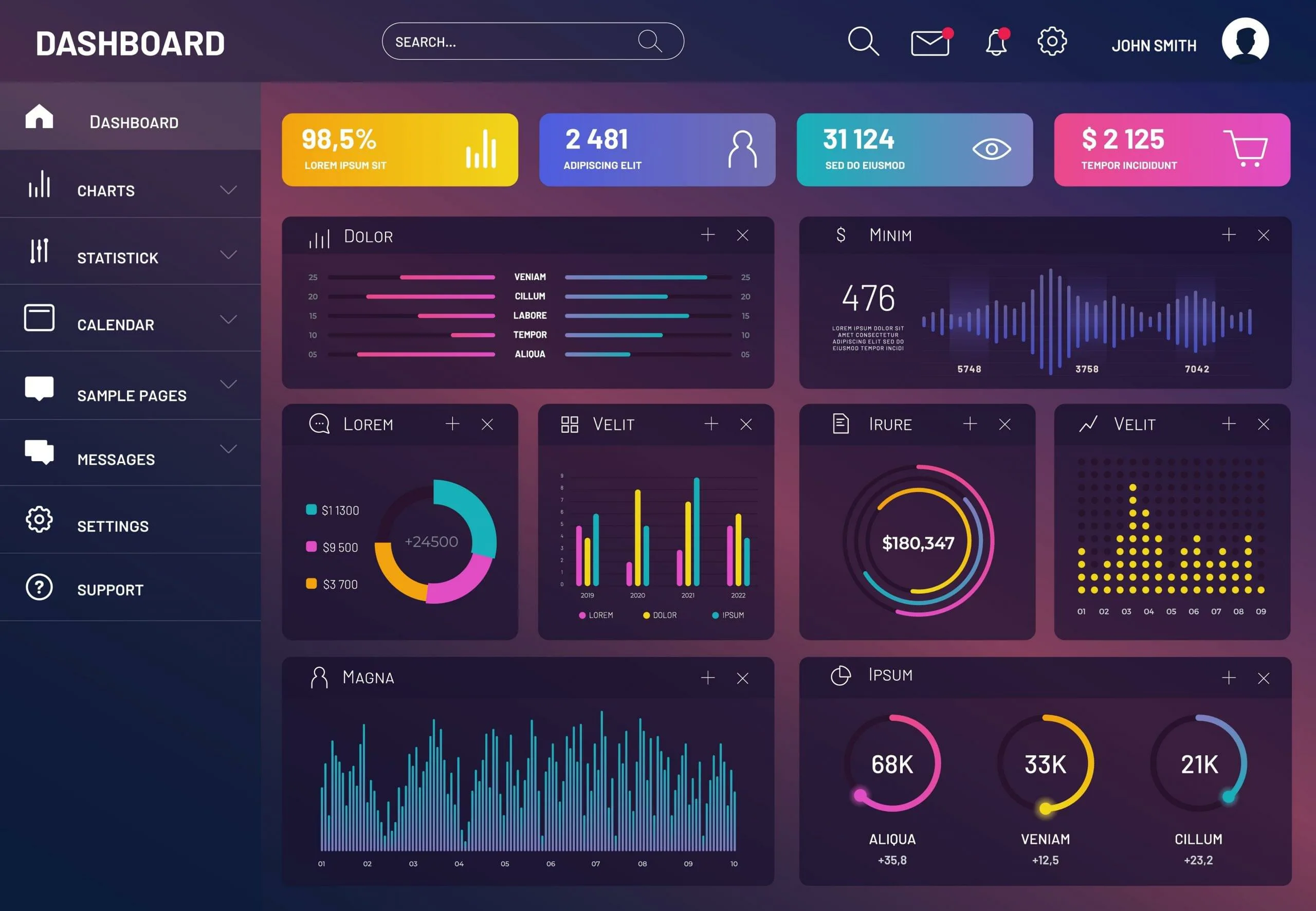
The shift towards dynamic dashboards represents a significant leap forward in this journey. These interactive tools allow users to manipulate data views, filter information, and drill down into specifics with unprecedented ease. This capability transforms passive consumption into active engagement, fostering deeper understanding and more informed conclusions. The emphasis is on empowering decision-makers with real-time, personalized insights, moving away from generic reports to tailored data experiences.
Dynamic dashboards profoundly change data interaction. They move beyond static reports, empowering users to actively explore, filter, and drill down for real-time insights. This interactive approach fosters a deeper, personal connection with information, cultivating proactive discovery. It fundamentally transforms how organizations understand complex datasets and make decisions.
Yet, crafting truly effective dashboards presents challenges. A common pitfall is prioritizing visual flair over clear functionality. The most powerful dashboards are intuitively navigable, directly addressing specific user needs. Without understanding user questions, even sophisticated visualizations can overwhelm, hindering informed decision-making instead of assisting it.
Data integrity is the bedrock of any reliable dashboard. Flawed, incomplete, or outdated underlying data renders even the most brilliant interface useless. Investing in robust data pipelines, consistent governance, and regular validation is critical. This builds trust in visualizations, establishing them as dependable tools for strategic guidance and confident decision-making.
User experience (UX) design is paramount for dynamic dashboards. A well-designed dashboard anticipates user questions, presents information logically, and minimizes cognitive load. This involves thoughtful layout, consistent visual elements, and clear labeling. Axorixunib recognizes an intuitive interface ensures even non-technical users quickly extract meaningful intelligence.
The future will likely integrate artificial intelligence and machine learning more deeply. These technologies can automate anomaly detection, suggest insights, and personalize dashboard layouts. This evolution transforms dashboards from interactive tools into intelligent partners in analysis, further enhancing their strategic value for companies like Axorixunib.
In conclusion, the development of interactive dashboards marks a pivotal advancement in data analysis, transforming information from static reports into dynamic decision-making tools. These technologies not only enhance the speed and accuracy of analysis but also make data accessible and understandable across all organizational levels, fostering a culture of informed, data-driven management.

Siddharth Bhullar
This article makes a strong case for dynamic dashboards. I'm curious about the initial setup time for such systems, especially with complex data sources.

Vartika Pal
That's a great question! While initial setup can vary, modern tools are designed for efficiency. The long-term benefits of clear insights far outweigh the upfront effort.

Karuna Chidambaram
Excellent overview! The point about balancing complexity and simplicity truly resonates. We often struggle with overwhelming our users.

Sunil Choudhury
Absolutely. It's a common challenge. Focusing on core user needs and iterative design can help achieve that crucial balance effectively.

Harmeet Goel
The future integration of AI and ML sounds promising. How accessible do you think these advanced features will be for smaller organizations?

Fatima Shah
Good point! We anticipate these features becoming increasingly democratized. Cloud-based solutions and intuitive interfaces will make them accessible to a broader range of enterprises.
Leave a Comment
Our Services
Portfolio
© All Rights Reserved
 Axorixunib