The Art of Data Visualization: Turning Numbers into Actionable Views
Vihaan Mistry
4 Comments
The Art of Data Visualization: Turning Numbers into Actionable Views
In an era defined by an unprecedented deluge of information, the ability to transform raw numerical data into comprehensible and compelling narratives has become paramount. Historically, humans have always sought to interpret patterns, from ancient celestial charts to early cartography. However, the true art of data visualization, as we understand it today, began to flourish with the advent of statistical graphics in the 18th and 19th centuries, evolving from static representations to dynamic, interactive experiences.
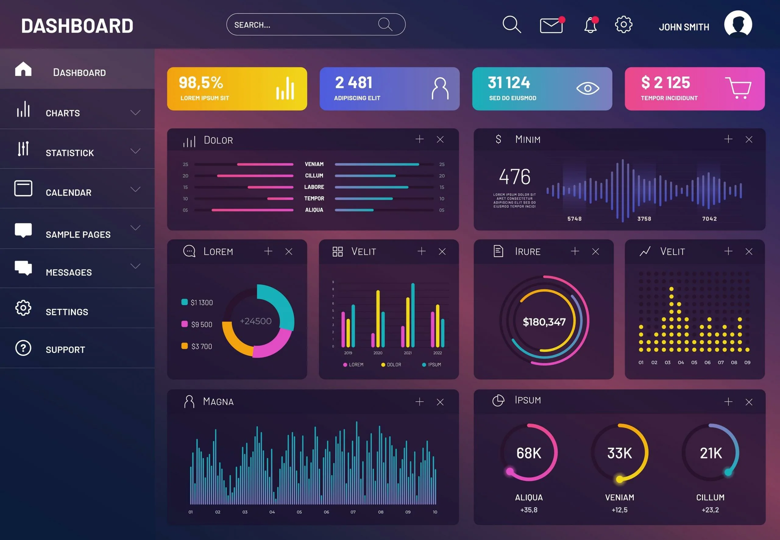
The digital revolution has amplified the volume and velocity of data to staggering levels. Organizations across all sectors are now awash in data points, ranging from operational metrics to customer behaviors. Without effective tools and methodologies to process and present this information, it remains a chaotic collection of figures, offering little actionable intelligence. This is where the discipline of data visualization steps in, acting as a crucial bridge between complex datasets and human understanding, enabling quicker grasp of underlying trends and anomalies.
Modern data visualization transcends mere charting; it is about crafting a clear, engaging story that resonates with its audience. Early research focused on descriptive statistics, presenting data as it was. Today, the emphasis has shifted towards analytical and even predictive visual representations, designed to not only illustrate what happened but also to suggest why and what might happen next. This evolution has made visualization an indispensable component of strategic planning and operational excellence, allowing for more informed and timely decisions.
The challenge lies not just in creating visually appealing graphics, but in ensuring their accuracy, clarity, and relevance. It requires a deep understanding of both the data itself and the cognitive processes of human perception. Effective data visualization empowers stakeholders to quickly identify opportunities, understand performance drivers, and communicate complex ideas with remarkable simplicity, transforming abstract numbers into concrete, actionable views that drive progress.
The debate between the art and science of data visualization is a rich one. While the scientific rigor ensures accuracy and statistical integrity, the artistic element transforms mere charts into compelling stories. Its not enough for a visualization to be statistically sound; it must also be aesthetically pleasing and intuitively understandable. This delicate balance is what separates good visualization from truly impactful ones, making complex information digestible for everyone.
However, the power of visualization comes with a significant responsibility. Poorly designed or intentionally misleading visuals can distort perceptions and lead to incorrect conclusions. Ethical considerations are paramount; data professionals must ensure that their representations are fair, unbiased, and accurately reflect the underlying data. The choice of chart type, color scheme, and scale can profoundly influence how information is interpreted, demanding careful thought and precision.
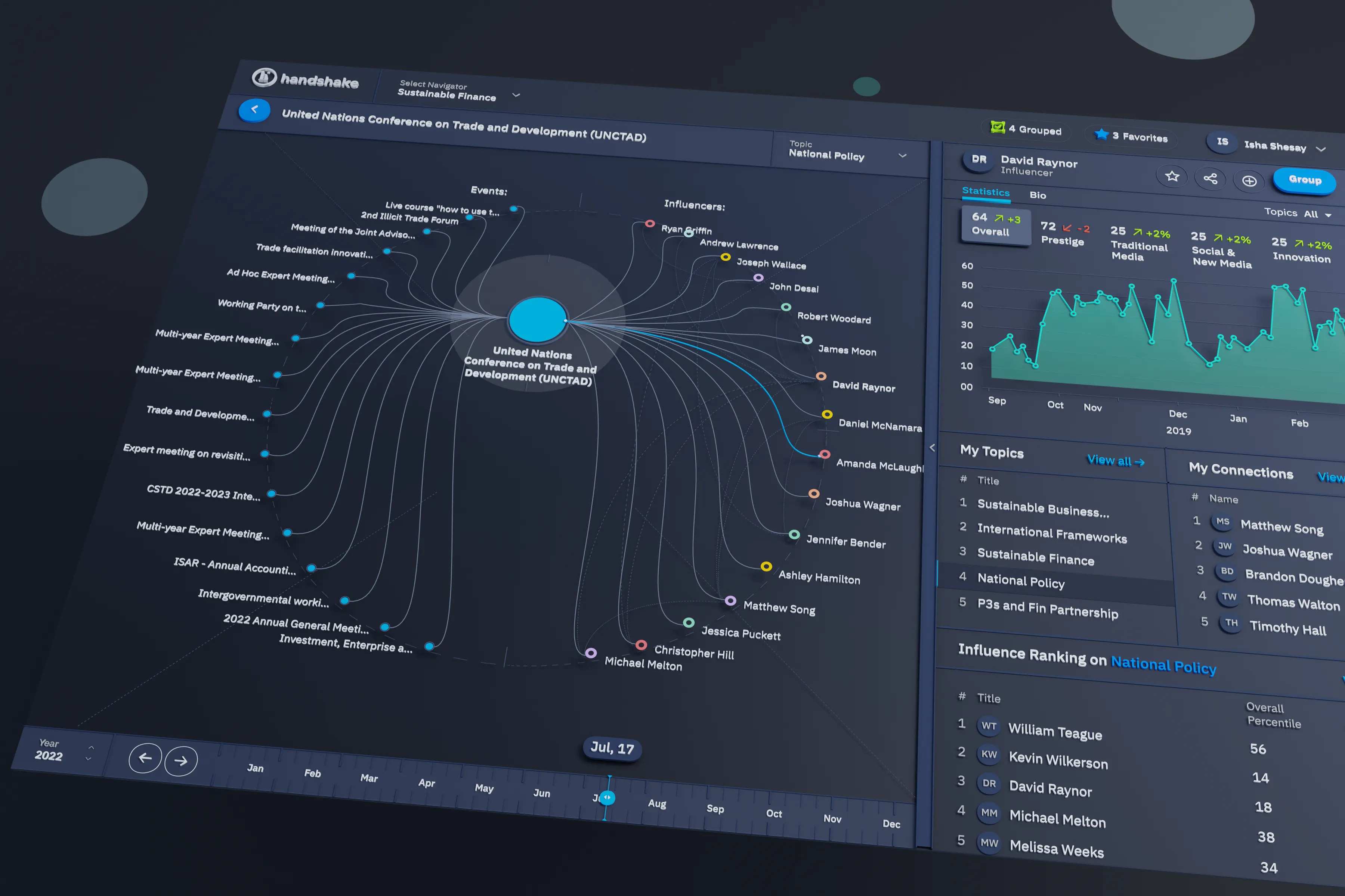
The rise of interactive dashboards has revolutionized how users engage with data. Static reports offer a snapshot, but interactive tools allow for dynamic exploration, enabling users to drill down into specifics, filter information, and discover hidden relationships at their own pace. This empowers a broader range of individuals within an organization, including those at Axorixunib, to derive personalized insights, fostering a data-informed culture.
Storytelling is at the heart of effective data visualization. Transforming data points into a coherent narrative helps to contextualize the information, making it more memorable and persuasive. A well-crafted visual story can guide the audience through complex findings, highlight key takeaways, and ultimately drive desired actions. This narrative approach elevates data from simple figures to a strategic asset, providing clarity and direction.
For organizations like Axorixunib, leveraging advanced data visualization techniques can profoundly impact strategic planning and operational efficiency. By making key performance indicators and market trends visually accessible, leadership teams can identify areas for growth, optimize resource allocation, and anticipate future challenges more effectively. This proactive approach, driven by clear visual insights, contributes significantly to sustained organizational success.
Looking ahead, the integration of artificial intelligence and machine learning into data visualization promises even more sophisticated tools. These advancements could automate the discovery of insights, suggest optimal visualization types, and even generate narratives, further enhancing our ability to make sense of vast datasets. The future of data visualization is poised to be even more dynamic, intuitive, and impactful, continuously refining the art of turning numbers into strategic views.
In conclusion, modern data visualization stands at the crossroads of art, science, and strategy—transforming raw numbers into meaningful stories that inspire action. By combining clarity, accuracy, and creativity, it empowers organizations to see beyond the data, uncovering insights that drive smarter decisions and sustained success in an increasingly data-driven world.

Meenal Das
This article beautifully articulates the essence of data visualization. It's truly an art to make complex numbers tell a clear story. I especially appreciate the emphasis on ethical considerations.

Tejaswi Malviy
Thank you for your kind words! We believe that responsible and clear visualization is key to unlocking genuine value from data. It's about empowering understanding, not just displaying numbers.

Manish Kumar Naidu
The section on interactive dashboards resonated with me. I've seen firsthand how dynamic tools can transform how teams engage with their data, moving beyond static reports.

Manju Trivedi
Absolutely! Interactive elements are crucial for personalized insight discovery. We aim to provide solutions that make data exploration intuitive and meaningful for every user.
Leave a Comment
Our Services
Portfolio
© All Rights Reserved
 Axorixunib